
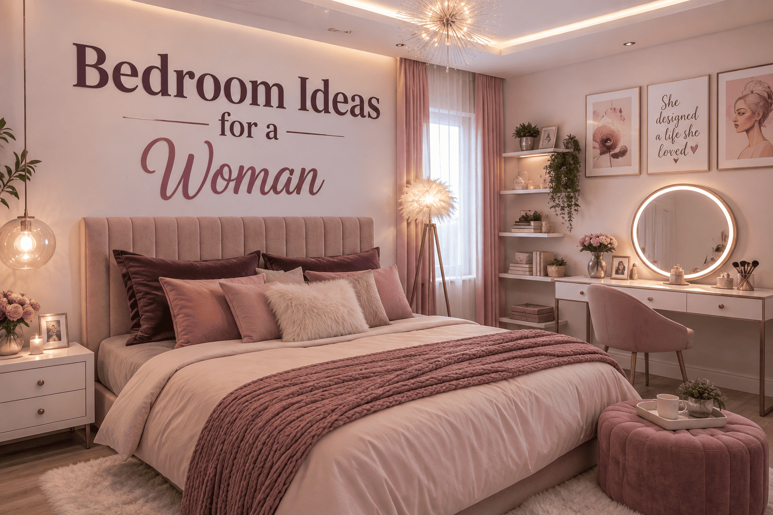
Pick one strong visual anchor — a saturated wall color, a dramatic headboard, an oversized light fixture — and let everything else in the room support it quietly. Add texture instead of extra objects, layer your lighting instead of relying on one overhead source, and keep the palette tight enough that nothing competes for attention. Glamour comes from editing, not from adding more.
Introduction
A bedroom is the one room that doesn’t have to answer to anyone else’s taste. It’s where a woman gets to decide what “beautiful” means on her own terms — not what a showroom says, not what matches the rest of the house, just what actually makes her want to walk in and close the door behind her.
The problem is that most “glamorous bedroom” advice defaults to the same handful of moves: a tufted headboard, a chandelier, a mirrored tray, maybe some faux fur. None of that is wrong, but it’s also not distinctive. Real glamour in 2026 has less to do with sparkle and more to do with confidence — bold color choices, unexpected materials, sculptural furniture, and lighting that actually changes how the room feels at 10 p.m.
You don’t need to redo the whole room to get there. Often it’s one strong decision — a color, a wall, a piece of furniture — that resets everything else around it. Below are 19 ways to make that happen, each built around a specific “why it works,” not just a picture-perfect idea.
1. Pick a Color Nobody Expects, Then Repeat It Three Times
Skip beige as a starting point and choose a color with actual mood — espresso, plum, deep emerald, terracotta, ink navy. The mistake most people make is using it once (a single accent wall) and stopping. Repeat the color at least three times across the room — bedding, a chair, curtains, or artwork — so it reads as a deliberate palette rather than a decorating accident.
Why it works: repetition is what separates an “intentional color story” from “we just liked this paint chip.”
2. Design for 10 PM, Not 10 AM
Most bedrooms are styled for how they photograph in daylight. Flip that. Picture the room with the overhead light off — just a couple of warm lamps, dim sconces, maybe one hidden light strip behind a headboard. If the room still feels good in that low light, it will read as genuinely luxurious, because that’s the version of the room you actually experience every night.
Why it works: hotel suites feel expensive largely because they’re lit for evening use, not for a real-estate listing.
3. Give One Wall an Actual Point of View
An accent wall usually just means “one wall painted a different color.” Go further: a hand-painted arch, a large mural, heavy textured wallpaper, or a floor-to-ceiling fabric panel behind the bed. Keep the furniture in front of it simple — a busy wall next to busy furniture cancels itself out.
Why it works: a wall with a distinct idea becomes the room’s identity in a single glance, which is what makes a space feel designed rather than furnished.
4. Make the Bed Feel Like Furniture, Not Just a Mattress on a Frame
A low, curved, upholstered frame reads completely differently from a standard boxed bed — it starts to look like a piece you’d choose for its shape, not just its function. Skip the pile of ten throw pillows and instead layer three or four different textures: linen sheets, a boucle throw, one velvet cushion, a knit blanket.
Why it works: texture variety does more visual work than pillow quantity, and it’s easier to keep tidy.
5. Let Soft and Hard Elements Argue With Each Other
Bedroom ideas for a woman doesn’t need to mean pastel and floral throughout. Pair delicate details — a curved lamp, blush textiles, rounded furniture edges — against something structural and dark: a charcoal wall, a black metal frame, walnut furniture.
Why it works: contrast is what keeps “feminine” from reading as “predictable.” The tension between soft and hard is what people notice first.
6. Build a Getting-Ready Corner That Earns Its Space
A narrow console, a well-angled mirror, and lighting that’s actually flattering (not overhead, not fluorescent) turn a random corner into a functional beauty station. Style it with three or four objects max — a perfume bottle, a jewelry dish, one small piece of art — rather than every product you own.
Why it works: a curated surface photographs and feels boutique; a crowded one just looks like a countertop.
7. Replace Ten Small Decorations With One Large One
A cozy living room should not feels unfinished, the instinct is to add more small things. Try the opposite: one oversized floor lamp, one large-scale artwork, one sculptural chair. Give it real breathing room — empty space around a large piece is what makes it read as a decision rather than clutter.
Why it works: scale creates confidence. A room with one striking object reads as curated; a room with fifteen small ones reads as accumulated.
8. Don’t Forget the Ceiling Exists
The ceiling is the most overlooked surface in most bedrooms. Even a subtly darker shade than the walls creates a cocooning, intimate effect. A statement fixture, some wood detailing, or full wallpaper on the ceiling turns it into an actual design element instead of blank space.
Why it works: because almost no one does this, even a small ceiling treatment reads as deliberate and unexpected.
9. Go Monochromatic, But Vary the Materials
A single-color room can feel flat if everything is the same fabric and finish. Combine several shades of one color with completely different materials in each: painted plaster walls, a linen duvet, a leather bench, a lacquered nightstand, a wool rug. The color stays calm; the materials keep it from feeling boring.
Why it works: the eye reads material contrast even faster than color contrast, so the room still feels rich despite the narrow palette.
10. Introduce One Material That Feels Expensive on Its Own
Instead of adding several “glam” accessories, pick a single high-impact material — travertine, fluted glass, brushed brass, polished plaster, natural stone — and use it in exactly one place, like a bedside table or a lamp base.
Why it works: one genuinely elevated material does more for perceived cost than five inexpensive shiny ones. It signals intention rather than volume.
11. Retire the Matching Furniture Set
Identical nightstands from the same collection tend to make a room feel like a catalog page. Pair two different pieces that share one connecting detail — same wood tone, same leg shape, same metal finish — instead of buying a matched set.
Why it works: a slightly mismatched but coordinated pairing signals the room was built over time, which reads as more personal and more expensive than a one-trip furniture purchase.
12. Treat a Few Fashion Pieces as Decor
If you already own beautiful accessories, let a few live in the open instead of in a drawer — a structured handbag on a shelf, a stack of jewelry in a glass tray, one striking pair of shoes styled like a small still life.
Why it works: it personalizes the room in a way generic decor can’t, and it costs nothing extra since you already own the pieces.
13. Frame the Bed Like It’s Art
Instead of a standard headboard, build an actual frame around the bed — a painted arch, a curved wall niche, a fabric canopy, or a built-in backdrop that runs floor to ceiling.
Why it works: framing draws the eye and defines the sleeping area as its own zone, especially useful in an open or larger room where the bed can otherwise get visually lost.
14. Use Glass and Acrylic to Keep Glamour From Feeling Heavy
Swap one or two solid furniture pieces — a nightstand, a side chair — for glass or acrylic versions. Sheer curtains do the same job for windows: visual interest without visual weight.
Why it works: transparency lets light and sightlines pass through, which is especially valuable in a small bedroom where solid furniture can make the whole room feel boxed in.
15. Let the Rug Set the Tone, Not Just Cover the Floor
A plain neutral rug is the safest choice and also the most forgettable one. A rug with real pattern — vintage-inspired, geometric, richly toned — can anchor the whole room’s palette on its own, especially if it’s large enough that the bed and nightstands all sit within its edges.
Why it works: rugs cover more visual area than almost any other single item in the room, so an interesting one has an outsized effect on how “designed” the space feels.
16. Give One Corner Permission to Be Extra
Not every part of the room needs to be considered. Pick a single corner and let it be dramatic — a sculptural chair with a small side table, an oversized lamp, a tight little reading nook — while the rest of the room stays calm.
Why it works: one intentional “moment” reads as personality; the same energy spread across the whole room reads as chaos.
17. Mix In One Genuinely Old Piece
A vintage mirror, an inherited lamp, or a flea-market side table next to otherwise contemporary furniture keeps a bedroom from feeling like it was bought in a single order. It doesn’t need to be valuable — it needs to look like it has history.
Why it works: one older piece breaks the “showroom” effect instantly and gives the newer furniture something to contrast against.
18. Build the Room Around What You Actually Own and Love
Skip trying to fit the room into a single label — “modern,” “feminine,” “maximalist.” Start instead with three or four things you’re genuinely drawn to: a color, a fabric, a type of art, a travel souvenir, a scent. Build outward from those instead of a Pinterest board that isn’t yours.
Why it works: rooms built from real preferences are harder to copy and easier to live in — which is ultimately what makes them feel expensive rather than staged.
19. Edit Ruthlessly Before You Call It Finished
The last, and most important, move is subtraction. Once the room is styled, go back through and remove one item from every surface. Bold design fails most often not from a bad color choice but from too many good ideas competing at once.
Why it works: restraint is what makes bold choices look intentional instead of accidental. A room with fewer, stronger decisions almost always photographs and feels better than one with everything included.
How to Keep Bold From Tipping Into Tacky
- Limit your palette to two or three real colors — everything else should be neutral support.
- Let one feature dominate per room, not several — a dramatic wall decor and a dramatic bed and a dramatic rug will fight each other.
- Choose texture over more objects whenever you’re tempted to add something.
- Repeat one finish — brass, walnut, matte black — in at least three places so the room feels connected.
- Prioritize scale and lighting over quantity. A few correctly sized, well-lit pieces will always outperform a room full of small decor.
Fresh Color Pairings Worth Trying
Espresso Brown + Cream — warm and grounded, cozy without tipping feminine.
Plum + Warm Beige — a more mature alternative to blush pink, romantic but not sweet.
Olive + Soft White — calm and earthy, especially good with natural wood.
Burgundy + Blush — bold depth balanced by softness.
Charcoal + Caramel — moody, modern, still warm.
Butter Yellow + Walnut — brighter, but grounded by dark wood so it doesn’t feel childish.
FAQ
What actually makes a bedroom look glamorous, not just decorated?
Restraint. A room with one or two strong decisions — a color, a wall treatment, a statement piece — reads as glamorous. A room with many small decorative choices usually reads as busy instead.
Can I get this look without buying new furniture?
Yes — lighting, bedding, a rug, and paint change a room’s atmosphere more than furniture does, and all four are relatively low-cost changes compared to replacing pieces.
What colors read as glamorous without feeling dated?
Deep, saturated tones — espresso, plum, burgundy, olive, charcoal — tend to feel current and sophisticated longer than pastel “glam” colors like blush and gold, which can quickly start to look trend-driven.
How do I keep a feminine bedroom from looking too soft or too young?
Pair soft, curved, or delicate elements with something structural and dark — a charcoal wall, black hardware, walnut furniture. The contrast does most of the work.
What’s the fastest way to make a small bedroom feel bolder?
Pick one focal point, keep the palette tight, and use glass or acrylic for at least one furniture piece so the room still feels open despite the added color or pattern.
Conclusion
None of this requires a full renovation or a designer’s budget. It requires making fewer decisions, but making them with more intention — one bold color instead of five safe ones, one striking piece instead of ten small ones, lighting that’s actually built for nighttime instead of an afterthought.
Choose the ideas from this list that genuinely sound like you, not the ones that sound impressive. The goal isn’t a room that looks like it belongs in a magazine — it’s a room that looks like it could only belong to you.

Leave a Reply